

Monday, 17 October 2011
Studio Charley on Cafe Press
Saturday, 17 September 2011
Studio Charley

Its not finished yet, but its getting there!
Tuesday, 6 September 2011
Busy, busy, busy
How is it I'm so busy when I don't have a job?
Oh I know!
My family have made me general dogs body. I'm painter, decorator, maid, nanny and any time I have left i'm applying for jobs! Who has time to update their blog? Not me for sure! And I've got loads of stuff I need to post that's MONTHS old! Dear god! What is a girl to do?
Stay tuned, hopefully I'll be posting like crazy over the next week or so.
Thursday, 30 June 2011
Take a look!

Saturday, 23 April 2011
QR Code

Monday, 18 April 2011
The Body Shop Packaging Concept

Packaging concept for The Body Shop. To simplify and unify all there products and packaging, with a focus on luxury but also on the ethos of protecting the environment and being natural. The packaging will be glass with aluminum lids and the labels will probably be made of recycled paper.
Sunday, 10 April 2011
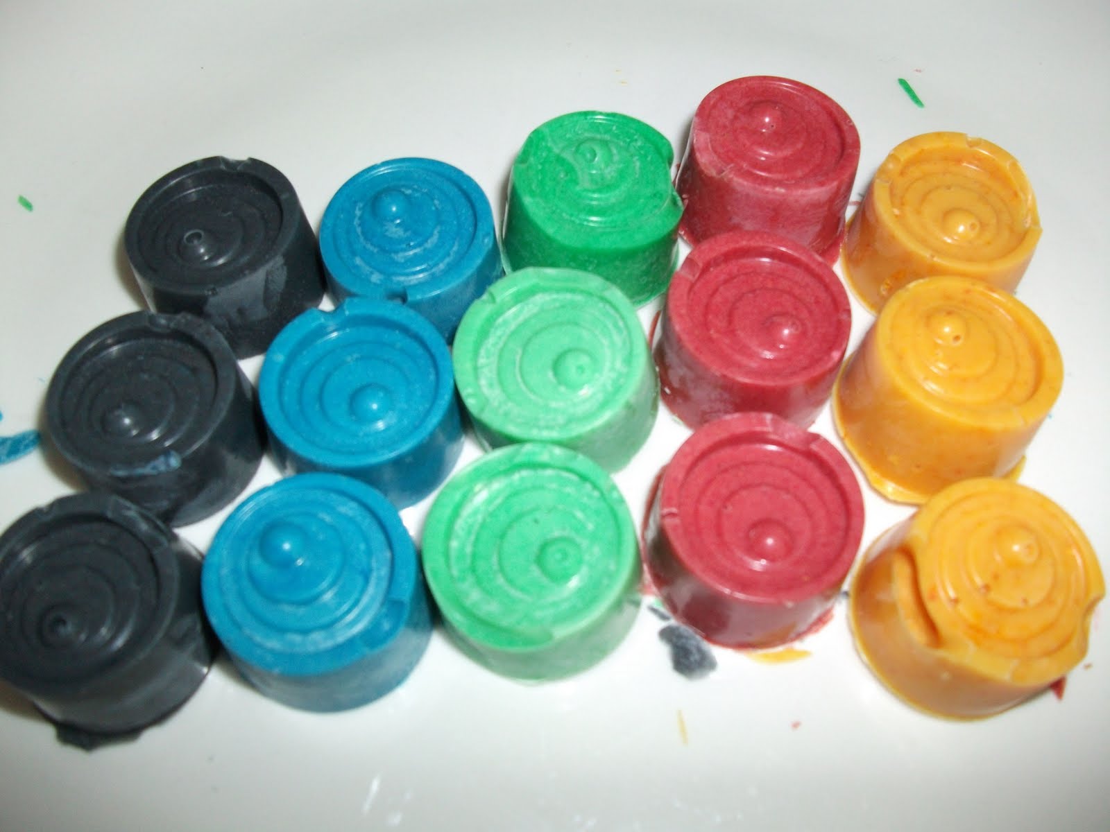
Coloured Chocolates
Me In a Box


These are what the finished chocolates looked like. Apparently I didn't tap the mold enough as they still wound up with some air bubbles, but other than that they look pretty good don't they?

These are what the finished chocolates looked like. Apparently I didn't tap the mold enough as they still wound up with some air bubbles, but other than that they look pretty good don't they?
Friday, 1 April 2011
Self Promotion
Me in a Box
I'm a colourful chocoholic, so what better way to get the attention of potential employers that to send them a box of colourful chocolates.

 Attempt number one, using completely natural coloring.
Strawberry
Green Tea
Orange
The results aren't particularly colorful.

Attempt number two
Mixing natural colouring with gel colouring.
 Red is freeze dried strawberry. Good.
Green was supposed to have green tea, but I'd forgotten I had used it up earlier. Oops.
Will take some photos of the finished product later.
I'm a colourful chocoholic, so what better way to get the attention of potential employers that to send them a box of colourful chocolates.

 Attempt number one, using completely natural coloring.
Strawberry
Green Tea
Orange
The results aren't particularly colorful.

Attempt number two
Mixing natural colouring with gel colouring.

Orange is orange zest. Possibly too much zest
Purple is sun dried blackcurrant. The pieces are too large. Possibly use freeze dried blackcurrant. The colour could also use some work, it is currently rather dull.
Blue has no flavour/natural colour. Possibly use
freeze dried blueberries.Green was supposed to have green tea, but I'd forgotten I had used it up earlier. Oops.
Will take some photos of the finished product later.
She Says Design Symposium
The Future of Design: 5 Top Female Creatives
I meant to upload my notes from the symposium ages ago, but obviously I didn't...oops. But I just stumbled across them in my notebook, so better late than never right?
According to a survey by the Design Council the average designer is 38, white and male. Not particularly good news for aspiring designs who don't fit that label. The correlation between study and profession doesn't seem to match. If I take a look around the studio, the number of female students outweighs males, and this assessment is backed up by the Design Council survey which states that a massive 70% of design graduates are female. So why then do they only make up 40% of the industry?
Rebecca White - "Good design is inspirational."
Margaret Calvert - "The design process is messy."
Emma Booty of Studio Conran said - The impossibility of imagining the future.
"You were the future, once." - David Cameron
Stop - Hold - Buy → Three seconds to get a consumers attention.
Imagining the future everyday.
D&AD - Perpetuating creative brilliance
- Laura Woodroffe & Rhiannon James
"Healthy disrespect"
Perpetuation of creative brilliance in commercial communications
What they look for ⎯ Good Ideas - Well executed - On brief
Get a name
- Why you want an interview with that company
- What the company do
- Their clients
- What work of theirs you like
Laura Kidd (Warrior Grrl)
-She Makes War
Authenticity
A finished idea is because is because a deadline is coming up
If you feel comfortable with an idea then you haven't pushed it enough
Its not more difficult for females than males to get employed
Tell a story through portfolio
You're interviewing them as much as they're interviewing you
Monday, 28 March 2011
Harcos Laboratories

Their current range consists of Mana Energy Potion, Health Energy Potion, Love Energy Potion, Luck Energy Potion, Tiger Blood, Blood Energy Potion, Zombie Blood, Nuclear Energy Powder, Zombie Jerky and Adonis DNA.
I am currently waiting for my Blood Energy Potion to arrive. After all this stuff has got to be tried. It's supposed to have the same colour and consistency of real blood, and apparently contains many of the nutrients found in it too. I guess I'll see what it's like for myself soon enough.
Oh and Blood Energy Potion also has its own website called Living With Bloodlust it's tongue in cheek :)
Macbook Cake

This so totally has to be added to my macbook collection, I love it!
Okay maybe I'm a little Apple obsessed (or as I believe Paul put it, an Apple Whore) but who wouldn't love to have this as their birthday cake?
Saturday, 26 March 2011
Frost Yourself Jewellery
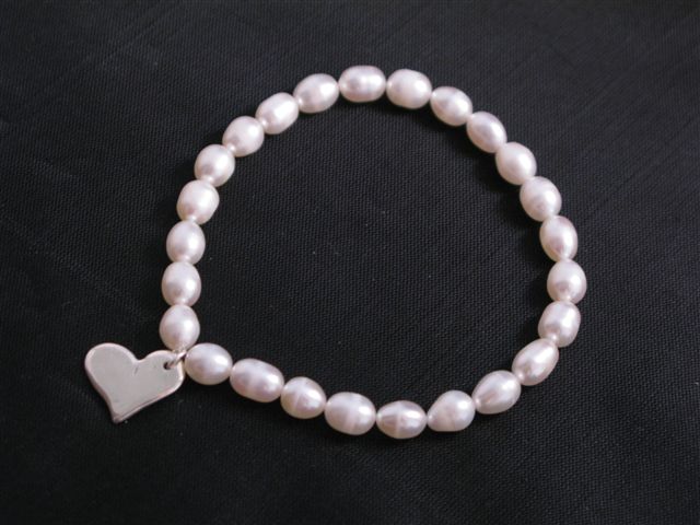
I made the heart using pure silver clay. Once I had worked the clay into the desired shape I left it to dry and then fired it on a gas hob. Once fired the silver had a white coating which was removed with a wire brush. After this the whole thing was filed and sanded smooth, and finally polished.
The bracelet itself consists of freshwater pearls.
Wednesday, 23 March 2011
Echoism
Echoism is a project by Julian Wolkenstein that tests the myth that symmetrical faces are more beautiful. By splitting a photo down the centre and flipping it two separate symmetrical identities of the subject are created. However it seems instead of making the 'perfect' version of the subject the creation of symmetry just seems to highlight the subjects flaws and create some slightly disturbing images. See what you think.

Tuesday, 22 March 2011
Ace
The Ace of Hearts

I love this photo by GaiaShirley
The effect of the the Ace of Hearts being in focus while the other cards start to blur around it is awesome. It really draws your eye to that specific card. Props to anyone who gets the symbolism :)
Sunday, 20 March 2011
20 Creative CV's
Francesco Mugnai's blog has a list of creative CV's, while I am not as enamored with them as I am with the list on Webdesigner Depot there are a few I like

Thursday, 17 March 2011
DeviantART
Been updating my DeviantART account. Adding more recent work and deleting old stuff. Can you believe I've had the account for over four years? Trust me it really showed! Some of the stuff of there was really awful! I'm embarrassed that I ever posted it. Anyway now it looks more professional.
Saturday, 12 March 2011
30 Examples of Creative CV's
Webdesigner Depot has a list of 30 creative and artistic resumes. Inspiration for when I actually get round to designing my own creative CV. It's on my to do list, honest! Anywho back to the CV's, some of my favourites


Once again I seem to be drawn more to simplicity and typographic designs
Saturday, 5 March 2011
400+ Creative Business Card Designs
LogoDesignerBlog has examples of creative business cards. Some of the designs are absolutely gorgeous but the one I like the best have kept their design simple.
.jpg)
.jpg)
Wednesday, 16 February 2011
Business Card Design

I was looking through Toxel's list of creative business cards and loved this one.
Its quirky and unusually shaped. A reminder that a business card doesn't have to be rectangular. Something to remember when designing my own business cards perhaps?
Friday, 21 January 2011
Simplified Packaging

A post on Toxel's website about clean packaging is a reminder that simplification is beautiful. Taking packaging with several different elements back to its bare bones could actually make it more effective and better looking on the shelf. Complicated design may not be the most effective.
A reminder to Keep It Simple Stupid!
Subscribe to:
Posts (Atom)